友链
所使用的主题目前已经实现友链,只不过并没有作为主分支,如果需要使用友链功能的话需要使用:
在魔改完之后,在content/page里添加links.md即可。也别忘了再添加完links.md之后在config.yaml中添加相关内容和links页面在左侧导航的权重:
menu:
    main:
        - identifier: home
          name: Home
          url: /
          weight: -100
          params:
              ### For demonstration purpose, the home link will be open in a new tab
              newTab: true
              icon: home
        - identifier: links
          name: Links
          url: /links
          weight: -75
          pre: link
网站详情
这里魔改了友链的格式
Music, Lyrics / ピノキオピー Animation, Video Director / えいりな刃物 Vocal / 初音ミク
也就当是学习自定义hugo shortcode的方式了
写shortcode
添加文件:layouts\shortcodes\articlelinks.html 该文件为go的template,我们添加如下内容:
<a target="_blank" href={{ .Get "url" }} title={{ .Get "name" }} class="article-link">
    <div class="article-link-div">
        <div class="article-link-avatar">
            <img class="article-avatar" src={{ .Get "avatar" }} />
        </div>
        <div class="article-link-info">
            <i class="fa fa-link" aria-hidden="true"></i>
            <i class="article-name">{{ .Get "name" }}</i>
            <p class="article-bio">{{ .Get "bio" }}</p>
        </div>
    </div>
</a>
如果使用过模板的话应该不是很难理解,具体的函数定义可以参考该网站:https://gohugo.io/templates/
接下来是样式:
添加文件:assets\scss\partials\layout\articlelinks.scss
写入如下内容:
// 头像边框颜色
$avatar-border-color: #566a82;
$avatar-border-color-dark: #C0C0C0;

// style-card 背景色
$article-link-background-color: #51a8ca10;
$article-link-background-color-dark: #69697141;

// 友链 name 原始色
$article-link-color: #11a1a2;
$article-link-color-dark: #ffffff;

// 友链 name 气泡响应对比色
$article-link-hover-color: #ea4e2f;
$article-link-hover-color-dark: rgb(241, 213, 159);

// bio 简介上下文
$context-color: #404040;
$context-color-dark: #c0c0c0;

// 友链头像及头像边框的样式
.article-avatar {
    border-right-color: #566a82;
        border-right-style: inset;
        border-right-width: 3.6px;

    [data-scheme=dark] & {
        border-right-color: #C0C0C0;
    }
    object-fit: cover;

}

.article-link-div {
    // 实现卡片双栏排列效果
    height: 175px;
    margin-top: auto;
    margin-inline-start: 4.5%;
    width: 90%;
    display: flex;

    // 控制上下连续排列的卡片之间的行距
    margin-bottom: 11px;

    // 卡片圆角
    border-radius: 7px 7px 7px 7px;

    // 卡片阴影
    -webkit-box-shadow: 0px 14px 32px 0px rgba(231, 224, 224, 0.15);
    -moz-box-shadow: 0px 14px 32px 0px rgba(0, 0, 0, 0.15);
    box-shadow: 0.7px 1px 6px 0px rgba(0, 0, 0, 0.16);

    // 卡片背景色
    background: $article-link-background-color;

    [data-scheme=dark] & {
        background: $article-link-background-color-dark;
    }

    // 卡牌气泡响应动画
    -webkit-transition: transform 0.4s ease;
    -moz-transition: transform 0.4s ease;
    -o-transition: transform 0.4s ease;
    transition: transform 0.15s ease;

    &:hover {
        transform: scale(1.03);
    }
}


.article-link-avatar {
    width: 300px;
    float: left;
    margin-right: 30px;
    display: flex;

}

// name 特效样式, hover 气泡效果,友链 name 变色
.article-link-info {
    margin-top: 13px;
    margin-right: 18px;
    color: $article-link-color;

    [data-scheme=dark] & {
        color: $article-link-color-dark;
    }

    &:hover {
        color: $article-link-hover-color;

        [data-scheme=dark] & {
            color: $article-link-hover-color-dark;
        }
    }
}

// name 文字样式
.article-name {
    text-overflow: ellipsis;
    overflow: hidden;
    white-space: nowrap;
    font-style: normal;
    font-family: auto;
    font-size: 20px;

}

// bio 文字样式
.article-bio {
    text-overflow: ellipsis;
    overflow: hidden;
    white-space: nowrap;
    margin-top: auto;

    // font: 12px/1 Tahoma,Helvetica,Arial,"\5b8b\4f53",sans-serif;
    font-family: Helvetica, 'Hiragino Sans GB', 'Microsoft Yahei', '微软雅黑', Arial, sans-serif;
    font-size: 16px;

    color: $context-color;

    [data-scheme=dark] & {
        color: $context-color-dark;
    }

}

// 响应式页面,允许根据不同的尺寸调整样式
@media screen and (max-width: 720px) {
    .article-link-div {
        width: 92%;
        margin-right: auto;
    }

    .article-bio {
        margin: auto;
        align-content: center;
        justify-content: left;
    }

    .article-link-avatar {
        width: 84px;
        margin: auto;
    }

    .article-name {
        font-size: 14px;
        font-style: normal;
        font-family: 'Microsoft Yahei', '微软雅黑', Arial, sans-serif;
    }
}
这就是纯纯的css了,这里魔改了友链的格式。
完成上述两步之后还需要参考一下友链的头文件修改:
在assets/scss/partials/style.scss中添加:
@import "partials/layout/articlelinks.scss";
一个蛋疼的倒计时
这里的倒计时是作为widget设计的(因为这个主题主页具有右侧的widget,因此这样做比较美观)
写scss和html
这里的样式参考了网上的一些样式。
在assets\scss\partials\widgets.scss中最后添加:
.widget.timeleft {
    .timeleft-content{
        font-size:35px;
        color: var(--card-text-color-main);
        font-family: 'Courier New', Courier, monospace;
    }

    div.timeleft-card {
        width: 350px;
        box-shadow: 4px 4px 8px rgba(0, 0, 0, 0.2);
        text-align: center;
    }

    div.timeleft-left{
        background-color: #4CAF50;
        color: var(--card-text-color-main);
        padding: 10px;
        font-size: 80px;
        border-radius: 15px;
    }

    div.timeleft-now{
        padding: 10px;
        color: var(--card-text-color-main);
        font-size: 30px;
    }
}
作为倒计时卡片的样式,之后是html内容:
这里需要新建这样的文件:layouts\partials\widget\timeleft.html
<section class="widget timeleft">
    <div class="widget-icon">
        {{ partial "helper/icon" "clock" }}
    </div>
    <h2 class="widget-title section-title">{{ T "widget.timeleft.title" }}</h2>
    <div class="timeleft-content">
        {{ .Site.Params.widgets.timeleft.content}}
    </div>
    <div class="timeleft-card">
        <div class="timeleft-left">
        {{ $end := .Site.Params.widgets.timeleft.time | time}}{{ $diff := now.Sub $end}}{{ $hour := $diff.Hours}}{{ $day:= div $hour -24}}{{ int $day}}
            </div>
    <div class="timeleft-now">
        {{ time.Format "Monday, Jan 2, 2006" now }}
    </div>
    </div>
</section>
大多数是go的语法,主要的是有一个.Site.Params.widgets.timeleft.content,这个是获得config.yaml中的参数,没错,我们的时间可以在config中设定。
细枝末节
首先是config中设定:
widgets:
enabled:
- search
- archives
- tag-cloud
- timeleft
archives:
limit: 5
tagCloud:
limit: 10
timeleft:
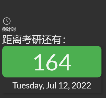
content: "距离考研还有:"
time: "2022-12-24"
sentence: true
前面是已经有的,在此基础上我们加入timeleft和相关的参数,最后一个sentence本来是想用来显示每日一句的,但是目前go语言不过关,暂且不搞了。
在完成上述内容之后可以看到倒计时已经出现在主页右侧了,但是有一个问题,没有“倒计时”三个字,这里需要在语言文件中设定一下本土化内容:在themes\hugo-theme-stack\i18n\zh-CN.yaml
中对应的位置添加上如下内容即可:
widget:
    archives:
        title:
            other: 归档

        more:
            other: 更多

    tagCloud:
        title:
            other: 标签云

    timeleft:
        title:
            other: 倒计时
最后实现的结果如图所示: